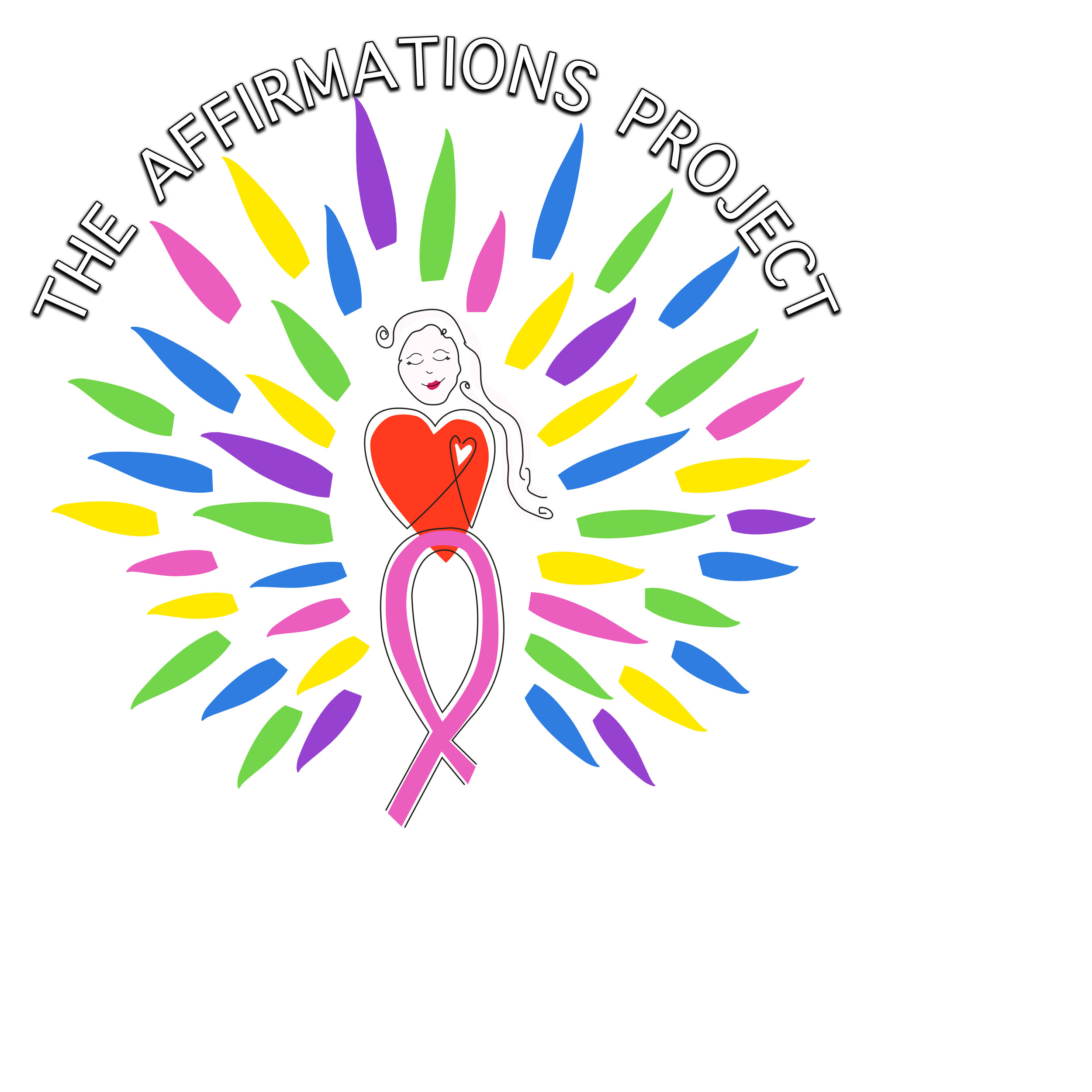
The Meaning of Our Logo
The Affirmations Project logo was designed to symbolize positive energy surrounding us by the power of self-love. The colors of the logo were carefully chosen because of their meaning:
Pink: It does not only represent breast cancer awareness but it is the color of universal love of oneself and of others. Pink represents friendship, affection, harmony, inner peace.
Yellow: In almost every culture yellow represents sunshine, happiness, optimism and warmth. Yellow is the most luminous of all the colors of the spectrum. It’s the color that captures our attention more than any other color.
Green: Motivation. Green motivation is very strong – perhaps the strongest of all. If it were a sound it would be a big deep bass note – vibrating and resonating in the very core of us.
Blue: Heroic. The note is high –delicate – sometimes even difficult to hear, but when heard so sweet and inspiring. Blue is about aspiration. Blue motivator demands growth.
Red: Is strong, powerful and dynamic – it glows with its own intensity. Red represents love, optimism, courage and confidence. You notice Red; you cannot help it. It is the color of stimulation and achievement.